

Login Flow Redesign – UI/UX
Overview
This project focused on improving the login experience by reducing user confusion and making error messages more meaningful. The design separates email and password entry into two clear steps, allowing for more specific guidance during login.
Problem
Most login systems display a generic message like “Incorrect login” when something goes wrong. This creates uncertainty—did the user mistype their email or their password?
Solution
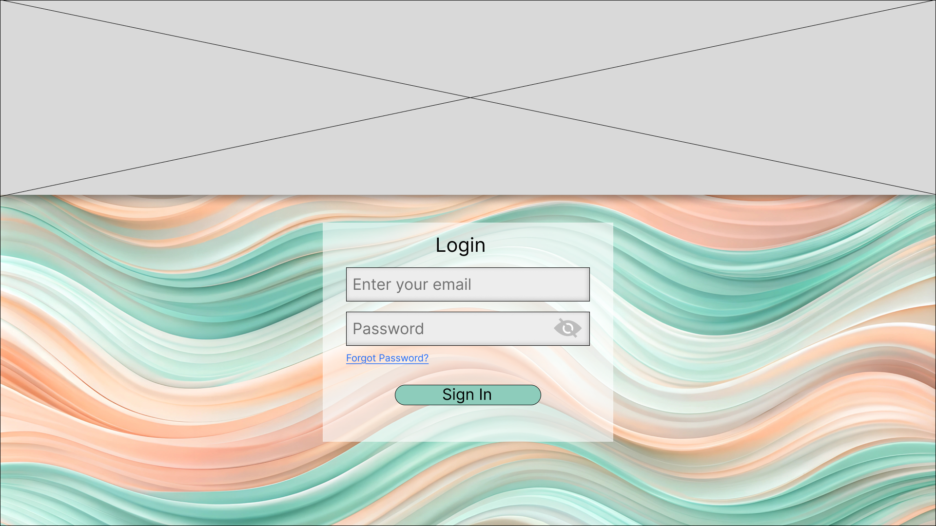
Step 1: Email Entry
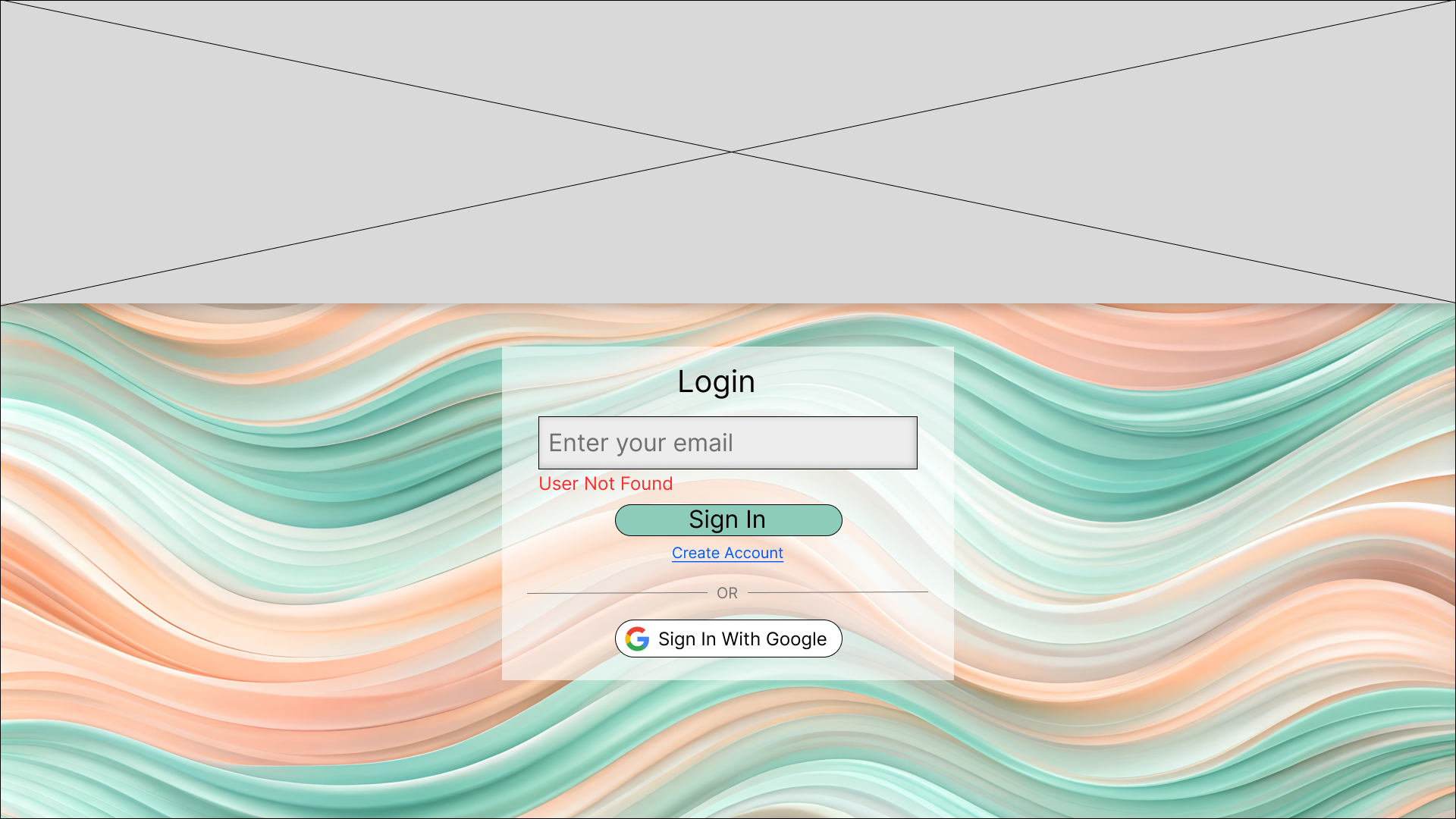
If the email isn’t found, the user is shown the message: “User Not Found.”
Step 2: Password Entry
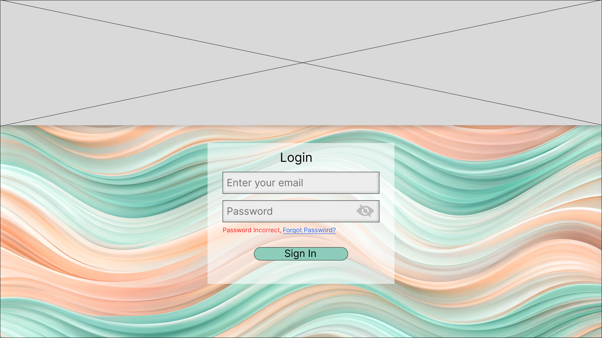
Once a valid email is entered, the user is prompted to enter their password, with more accurate feedback if it's incorrect.
Screens & Design Examples
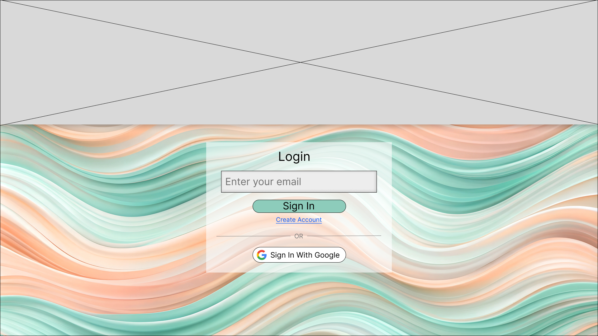
1. Initial Email Entry Screen
Clean and minimal — focuses user attention on entering their email first.

2. Email Not Found Error State
Displays a clear “User Not Found” message.

3. Valid Email → Password Entry Screen
Once a valid email is entered, the password field appears.
4. Incorrect Password Error State
Clearly distinguishes a password mistake from an email issue.

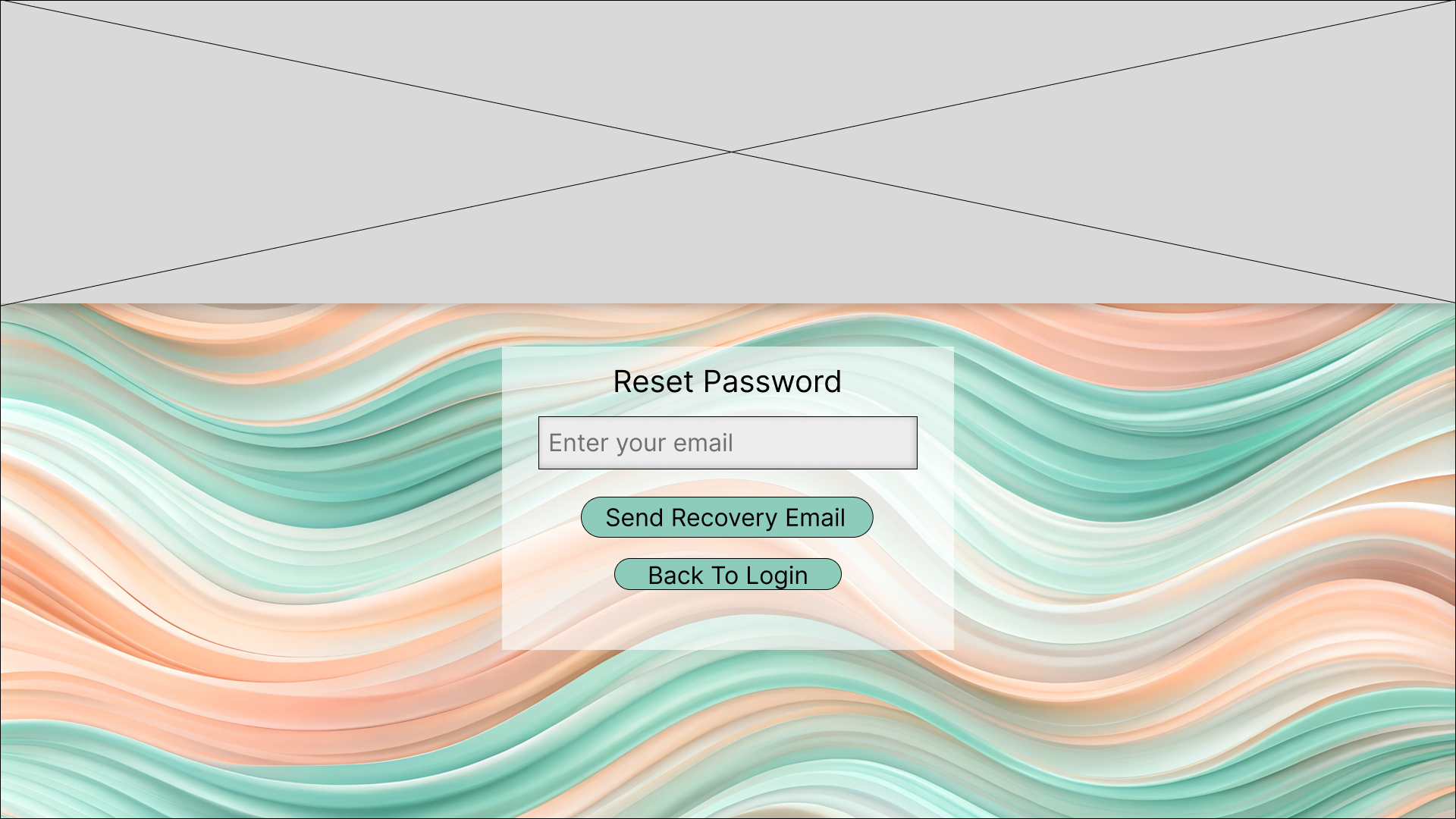
5. Forgot Password Screen
Gives users an easy way to recover access by sending a recovery email to them.
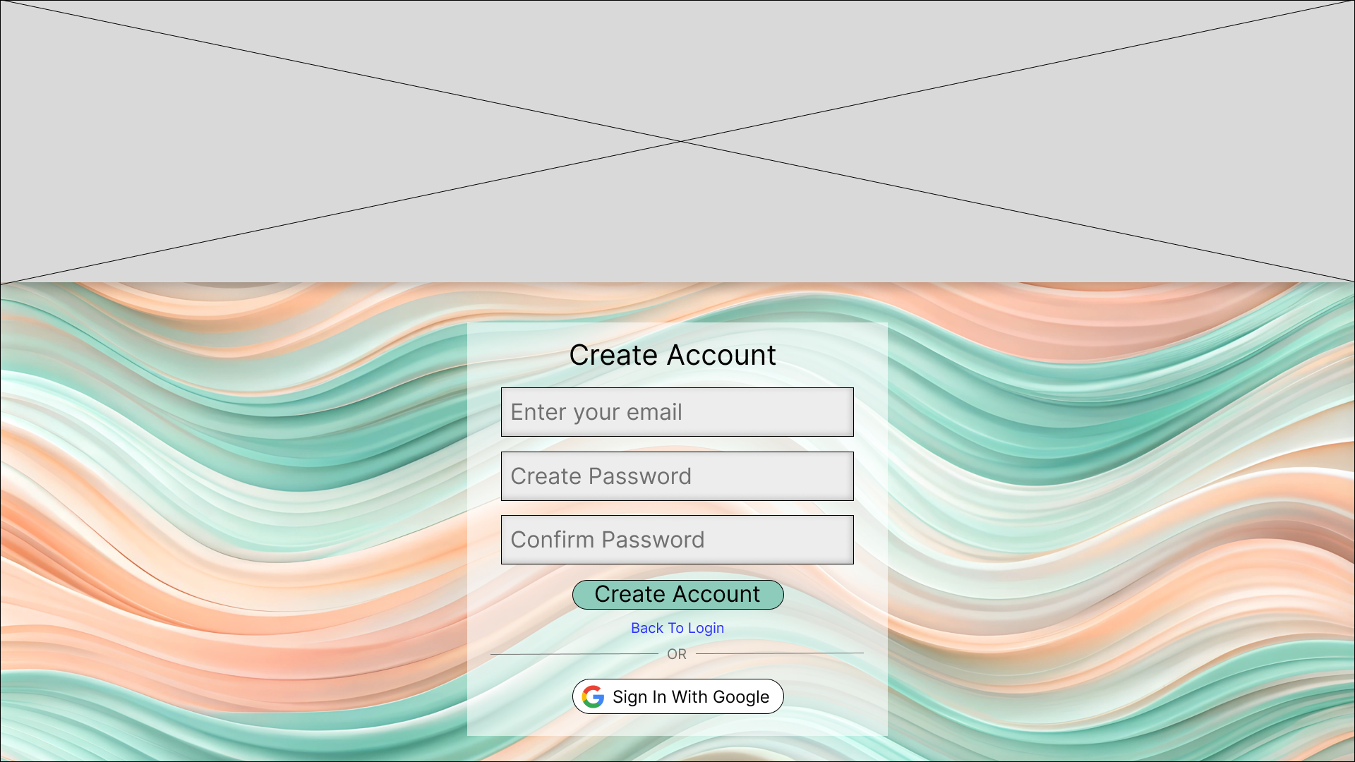
6. Create Account Screen
Allows new users to get started quickly.

Tools Used
Figma for UI design and prototyping
WordPress for portfolio presentation
Outcome
The final design results in:
A more intuitive and frustration-free login flow
Error messages that provide clear, contextual feedback
A modern, user-focused interface that improves trust