Steam-like Platform
This project was developed in collaboration with Inkognido to explore the design of a web3 gaming distribution platform inspired by the accessibility of services like Steam. The platform was envisioned to support both large scale titles and independent developers, allowing players to discover games, earn in game items, and convert those items into real digital assets through an integrated marketplace.
Each game is connected to a blockchain, enabling players to unlock achievements that directly contribute to their inventory and ownership. Throughout the project, my focus was on creating an experience that is easy to navigate and understand while maintaining a distinctive visual identity aligned with Inkognido’s brand. The result is a clean, approachable interface that balances usability with a unique layout tailored to the needs of a modern web3 gaming platform.

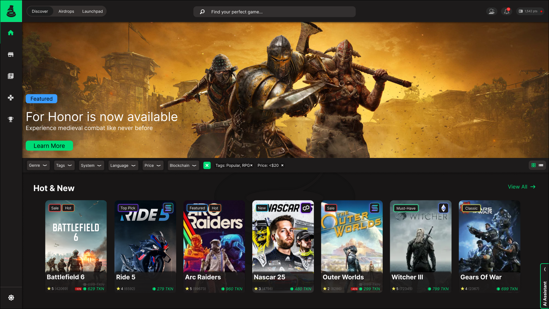
Discover Page
This page was designed to make game discovery feel simple, readable, and efficient. I focused on creating a clear visual hierarchy that allows users to quickly identify game titles, pricing, supported blockchains, and any active sales at a glance. Game cards use a consistent layout with compact visual indicators so important information is easy to scan without distracting from the artwork.
The filter section was intentionally kept slim and unobtrusive while still offering a wide range of options. Filters are easy to read and apply, allowing users to refine results by genre, price, blockchain, and other criteria without interrupting the browsing experience. Overall, the design balances simplicity with depth, giving users control and flexibility while maintaining a clean, modern storefront experience.
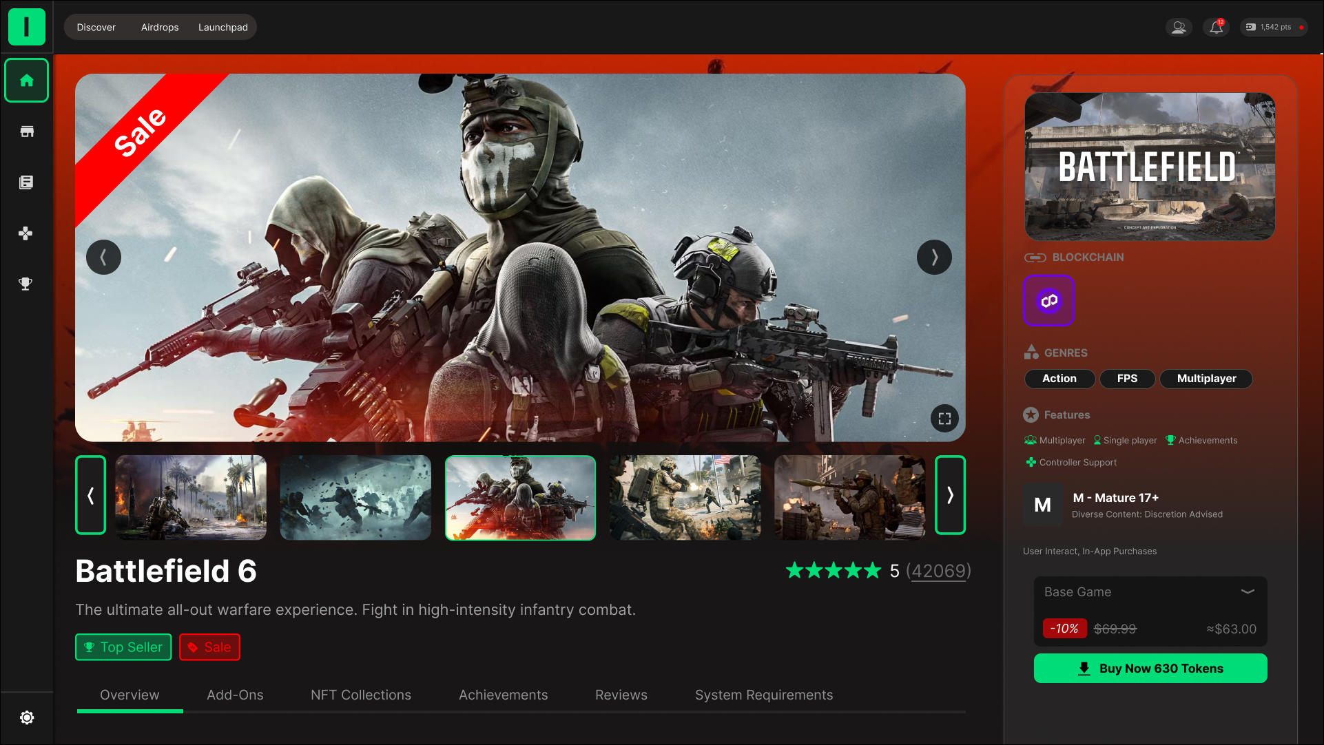
Game Details Page
This page was designed to give users a clear and immersive view of an individual game while keeping key information easy to find and understand. The layout prioritizes visual content through a large media showcase, allowing users to explore screenshots and videos before making a purchase decision. Supporting details such as the game description, ratings, and feature tags are positioned nearby to reinforce context without interrupting the visual flow.
Pricing and purchase actions are grouped together in a dedicated panel to ensure they remain visible and accessible at all times. Information such as supported blockchains, genres, content ratings, and achievements is presented using concise labels and icons to improve scannability and reduce cognitive load. Overall, the design balances presentation and utility, creating a focused experience that helps users quickly evaluate a game and confidently move toward purchase.
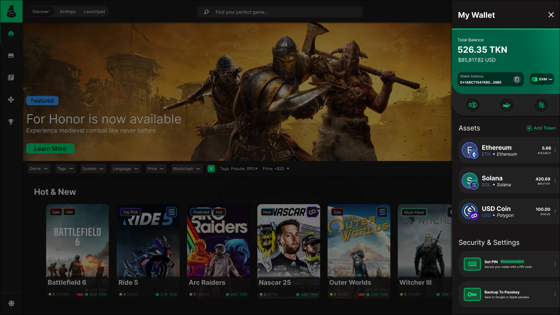
Wallet
The wallet slideout was designed to provide quick, contextual access to key financial information without interrupting the user’s workflow. By using a slideout panel, users can view balances, manage assets, and access security settings while staying within the main platform experience.
The layout emphasizes clarity and trust, with total balances displayed prominently and individual assets organized in a clean, scannable list. Clear labeling, recognizable icons, and consistent spacing help users easily understand their holdings across multiple blockchains. Security and settings options are visually separated to reinforce their importance while keeping the overall experience simple, accessible, and aligned with the platform’s visual language.
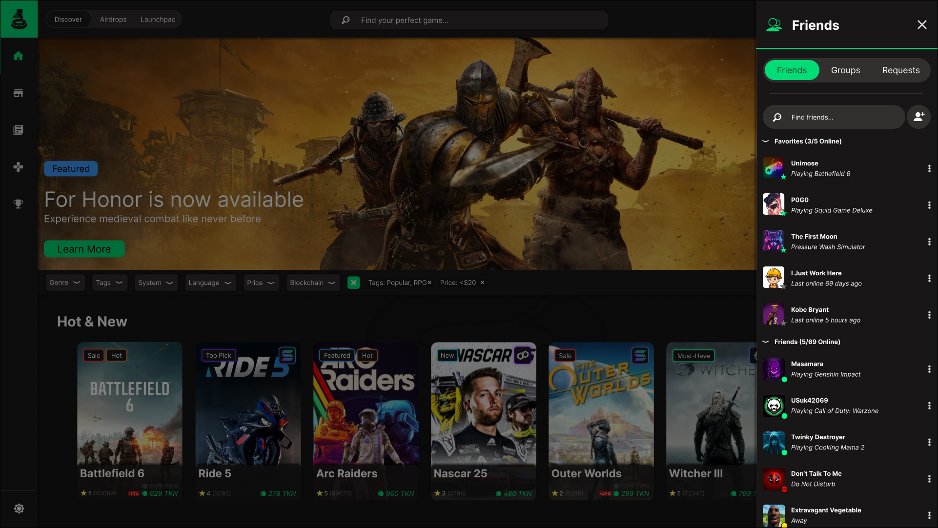
Friends
The friends slideout was designed to make social interactions quick and accessible without disrupting the core browsing experience. By using a slideout panel, users can view their friends list, current activity, and online status while remaining connected to the main platform.
The layout emphasizes scannability, with clear grouping for favorites, online friends, and offline users. Status indicators and activity labels allow users to quickly see who is available and what they are playing at a glance. Search and navigation tabs are placed at the top for easy access to friends, groups, and requests, keeping social management simple and intuitive.
Overall, the design supports lightweight social engagement, allowing users to stay connected and informed without adding unnecessary complexity to the interface.
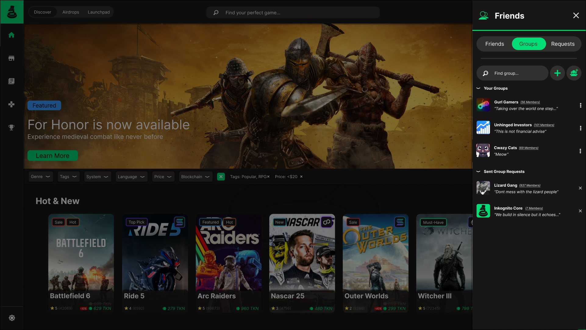
Groups
The groups section was designed to support community engagement while remaining lightweight and easy to navigate. Within the slideout, users can quickly view their active groups, discover new communities, and manage pending group requests without leaving the main platform.
Groups are presented in a clear, vertical list with visual identifiers, member counts, and short descriptions to help users understand each community at a glance. Search and action controls are positioned at the top to streamline group discovery and creation, while sent requests are separated to reduce clutter and maintain clarity.
Overall, the design balances visibility and organization, making group interaction feel accessible and integrated rather than intrusive.
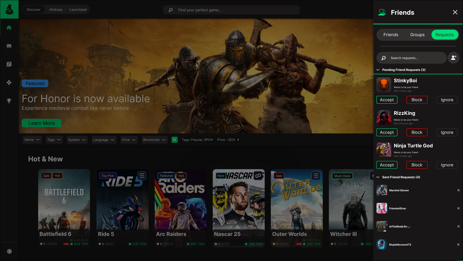
Requests
The requests section was designed to give users clear control over incoming and outgoing friend requests while prioritizing safety and ease of management. Incoming requests are presented prominently with clear actions to accept, decline, or block, allowing users to quickly respond or protect themselves from unwanted interactions.
Outgoing requests are displayed separately below, with a simple cancel action to reduce friction if a request needs to be withdrawn. A search function is included to help users quickly locate specific requests, ensuring the experience remains efficient and manageable even when handling a large volume of interactions.