Gears of Discovery
Gears of Discovery was my capstone project at Full Sail University, where I served as Lead Game Designer, Lead UI/UX Designer, and Level Designer. I contributed to multiple aspects of the project, including the Tutorial Level, Player HUD, Menu Screens, Game Mechanics, and In-Game UI. Collaborating with a team of students, I participated in weekly sprint meetings to review design updates, discuss UI and gameplay changes, and plan upcoming development milestones. Using Unreal Engine 5, I implemented functionality through Blueprint, integrating UI elements directly into the game environment. Designing and coding the UI components was both challenging and formative, marking the beginning of my passion for creating intuitive, engaging, and visually cohesive user interfaces.
Menu Screens
Player HUD
The players HUD has many different aspects to it. Within the player HUD is the Lives counter, HP and Stamina meters, Screw collection counter, timer, and inventory. All aspects of the player HUD needed to be individually adjusted with their own properties set up. These were all controlled with functions within the player HUD widget blueprint in unreal engine 5. Each element needed to be properly placed in the players screen bounds and designed in a way that is easy to understand for the player.
Lives Counter
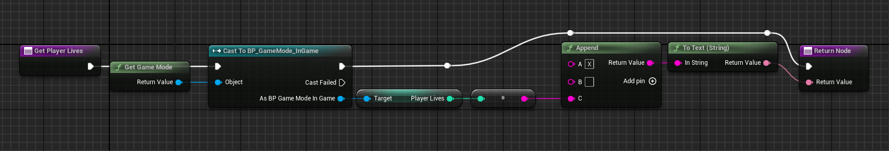
The Lives Counter is a core HUD element that tracks the player’s remaining lives throughout each level. In Gears of Discovery, players start with three lives per level, and the level ends when all lives are lost. The system references the player character, appends the current lives variable to a string (X Player Lives), and updates the text block in the upper right corner in real time as the player progresses.
The design of the player lives icon was critical for immediate recognition. Using the player character’s head as the icon, similar to classic games, allowed players to intuitively associate it with their avatar and remaining lives. Placing the counter in the top right corner keeps essential information accessible without obstructing the player’s view of obstacles and puzzles, balancing clarity, usability, and screen space.
HP and Stamina Meter
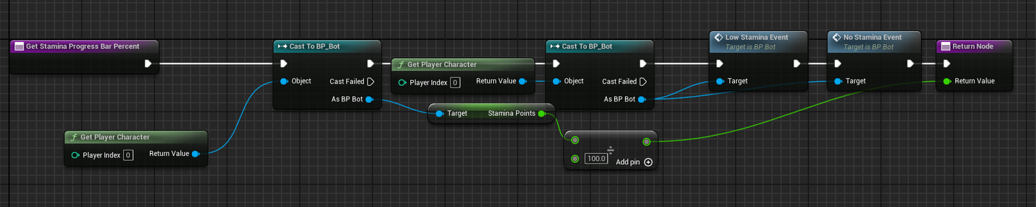
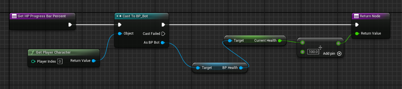
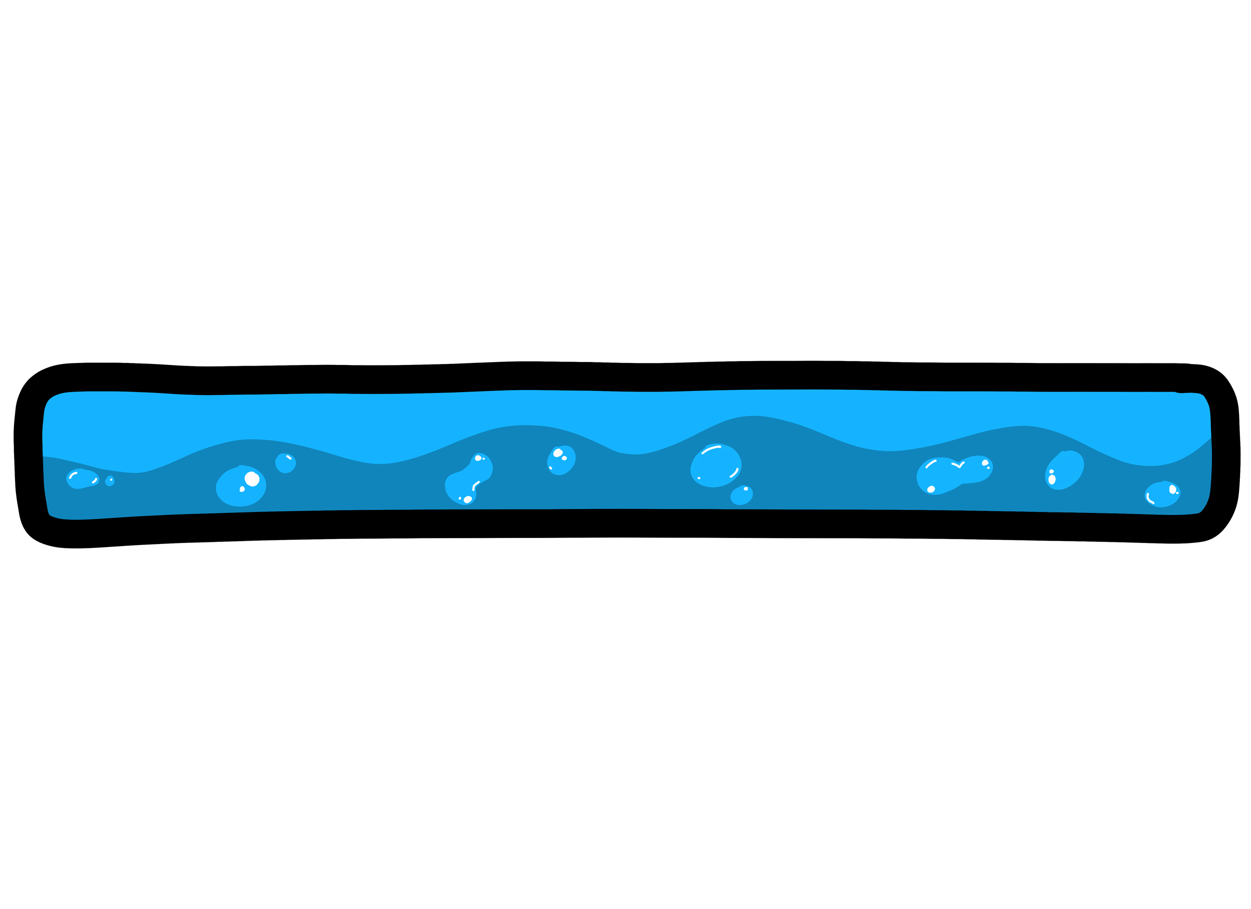
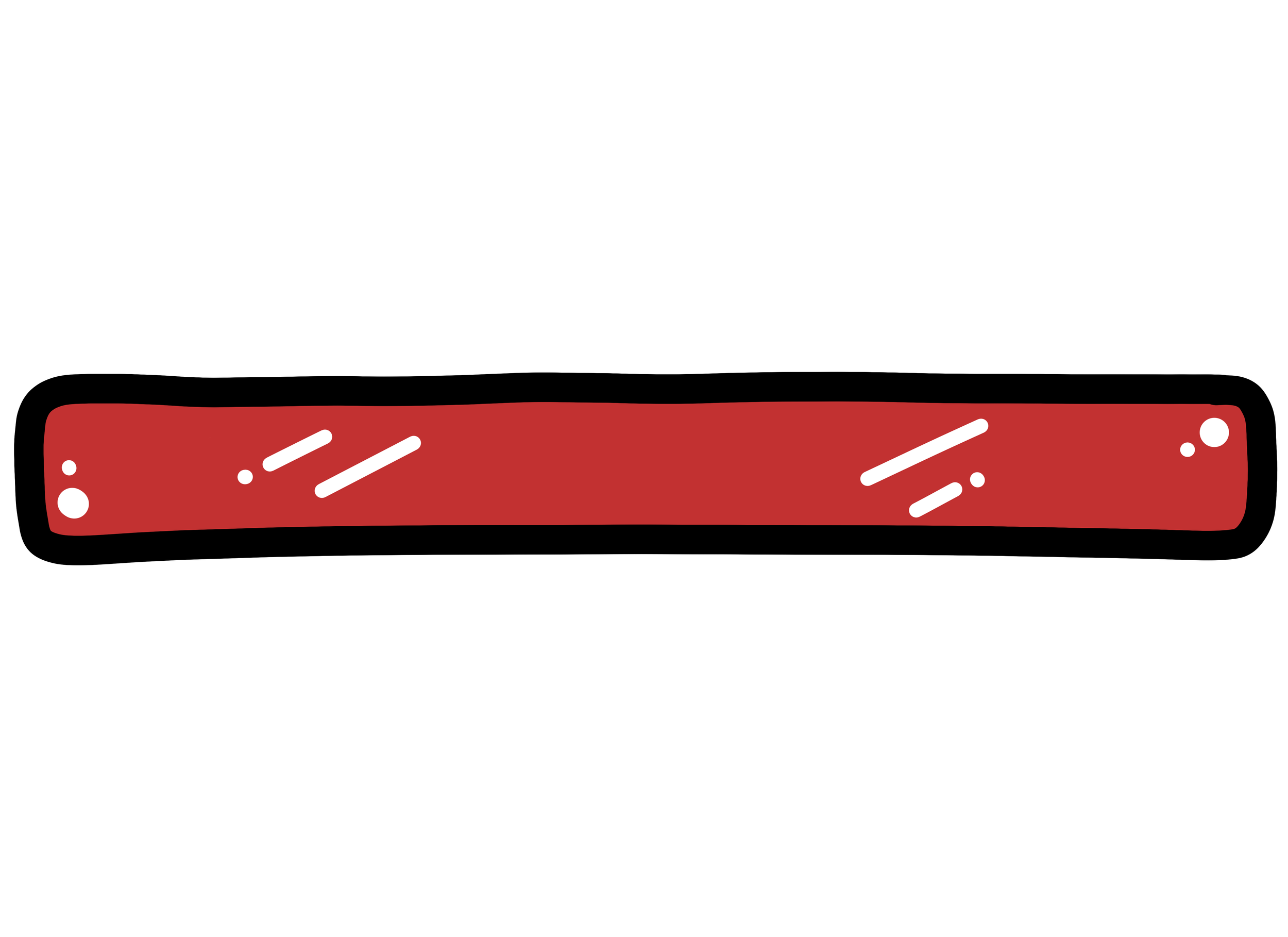
The HP and Stamina meters provide real-time feedback on the player’s vital stats, using a percentage-based system linked directly to the player character’s variables. Both meters pull their respective values from the player blueprint, dividing the current value by the maximum (100) to determine the fill percentage. The values are then dynamically updated in the HUD via Unreal Engine’s widget blueprint system, ensuring that changes to health or stamina are immediately reflected. This approach maintains clarity and consistency in conveying the player’s status while supporting responsive gameplay feedback.
The design of the icons and progress bars reinforces intuitive understanding and thematic consistency. The HP icon features a half-robot, half-human heart, tying directly to the player character’s narrative and standing out from traditional heart icons. The HP bar is red, leveraging the universal visual cue for health. The Stamina icon, inspired by a cartoony lightning bolt, represents energy in a visually engaging way, with its progress bar appearing as a bright, fluid-like meter beneath the HP bar to indicate sprint capacity. Additional HUD events, such as low and depleted stamina notifications, provide interactive feedback to the player, enhancing situational awareness while maintaining visual hierarchy and immersion.
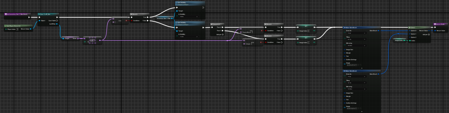
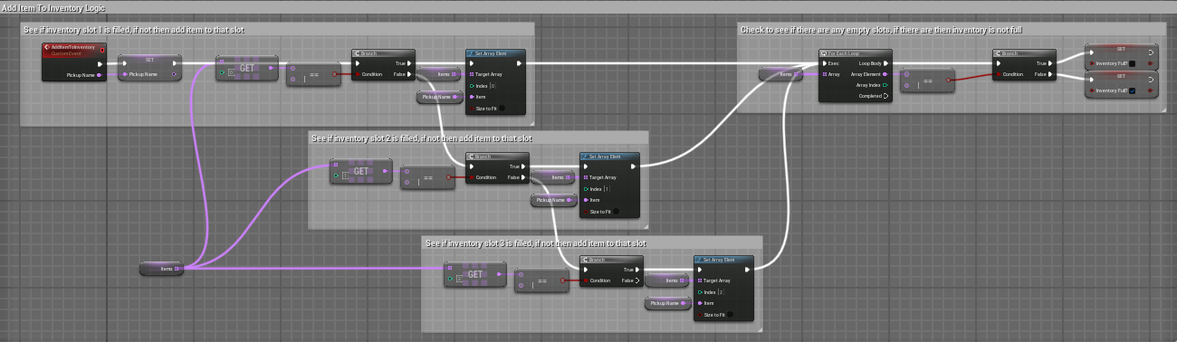
Player Inventory
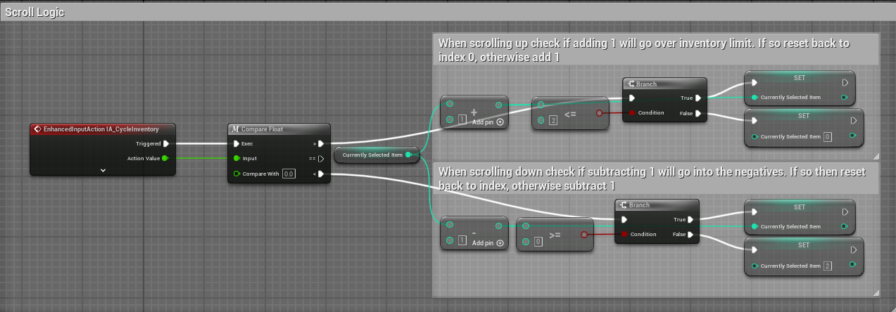
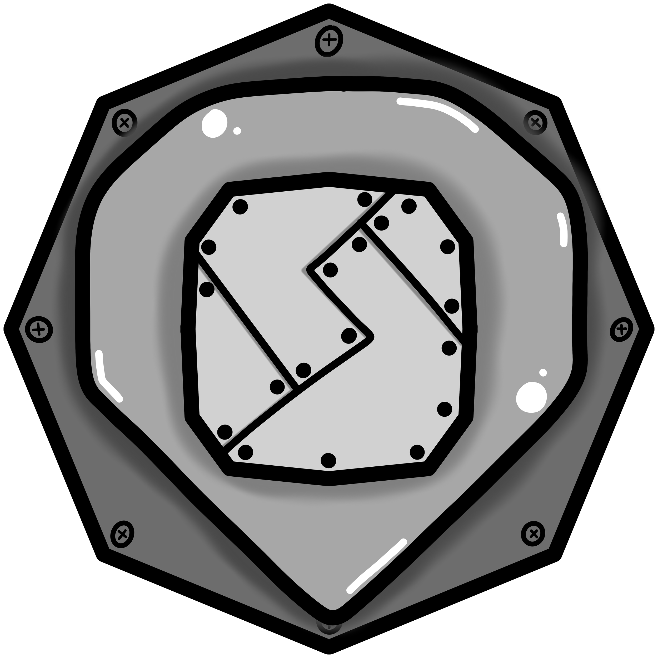
The Inventory Slot icon was designed to clearly communicate its function as a container within the player’s HUD while reflecting the metallic, robotic nature of the main character. Its distinct shape separates it visually from other UI elements, creating immediate recognition. To indicate selection during scrolling, the active inventory slot enlarges slightly while remaining centered, providing a subtle yet clear interaction cue for the player.
Pickup icons were created with clarity and thematic consistency in mind. The Shield icon, displayed in the player’s inventory slots at the bottom center of the screen, uses a familiar shape with bright orange tones to convey protection intuitively. The Speed Boost icon mirrors the design of the Stamina meter, using a battery motif to visually link speed-enhancing mechanics to existing UI metaphors. The inventory system itself is structured for usability, allowing players to scroll seamlessly between slots, loop through selections, and automatically assign picked-up items to the first available slot. Full inventory checks prevent overfilling, ensuring the system remains predictable, intuitive, and responsive to player actions.
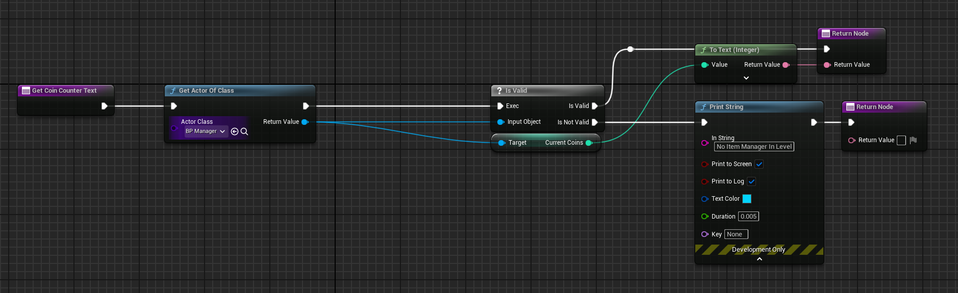
Screw Collection Counter
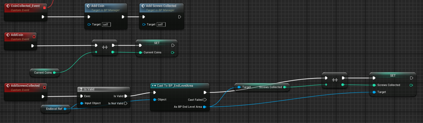
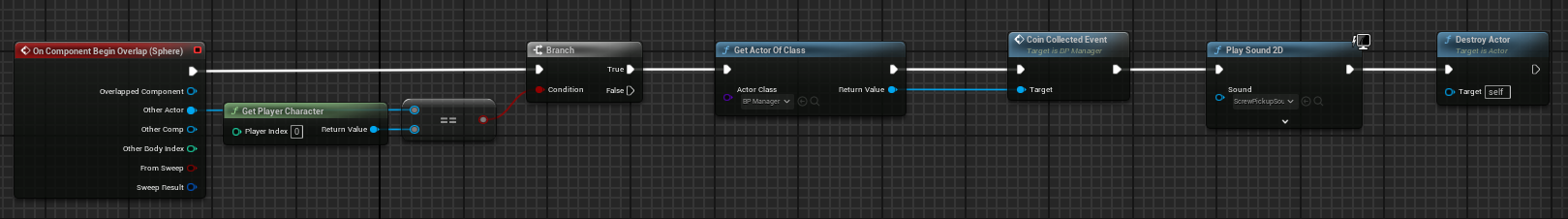
The screw collection counter uses two separate blueprints to function. Within each level a BPManager actor is placed within the level. This tracks when the player overlaps with the coin pickup. The event is called and the BP_Manager increases the coin collection by 1. The widget for the player HUD then pulls that number from the manager and changes the coin text in the player HUD to the current value.
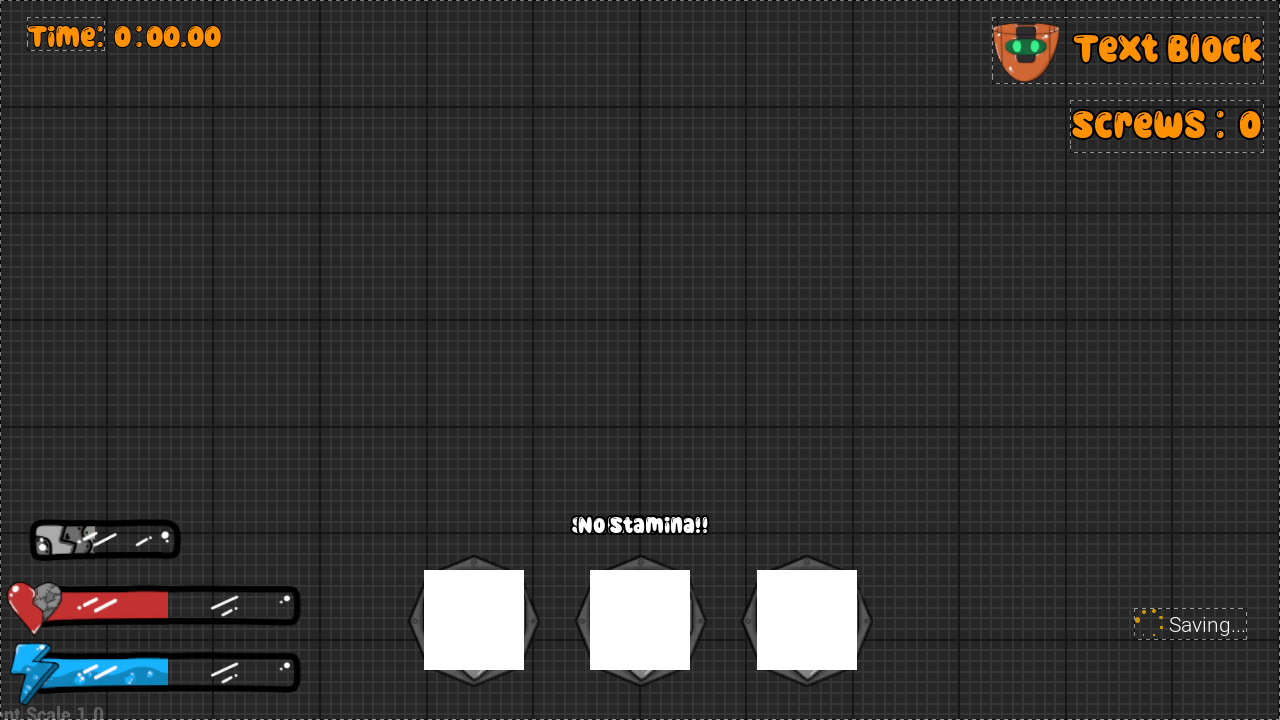

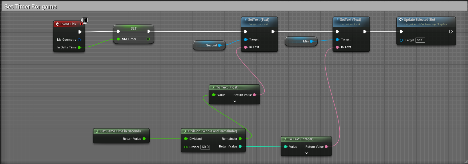
Timer
The timer is the simplest thing to set up. By getting the game time is seconds we are able to obtain the seconds and minutes elapsed. These values are then split off and the text is set based on whatever that value is.


Menu Screens
There are quite a few menu screens within Gears of Discovery. The main menu, settings menu, level select menu, credits, how to play, and the in game pause menu. Each menu within Gears of Discovery serves it’s own purpose but all of them follow the same art style. With the menu screens I wanted the player to be able to quickly and easily understand what they were looking at and be able to traverse the menu with ease. On top of this each menu should be satisfying to the player, through visual and audio.
Main Menu
The main menu was the first menu that needed to be worked on, since it would be the menu the player first sees when booting up the game. Within this menu there are a few things I wanted. The menu screen needed to be interesting and keep the eyes busy, but not too busy to where the player did not know what to focus on. I opted to create a moving background that was blurred a bit as to not have the player focus too much on what was going on there. This background is just a short clip of gears turning with one another. This kept it interesting but not too busy.
The main logo for Gears of Discovery needed to be somewhere on the main menu, otherwise people who loaded up the game would have no idea what game they were playing. For the placement of this I decided to have it at the top left corner of the screen, big enough to show off the logo but not too big to draw attention away from the menu buttons.
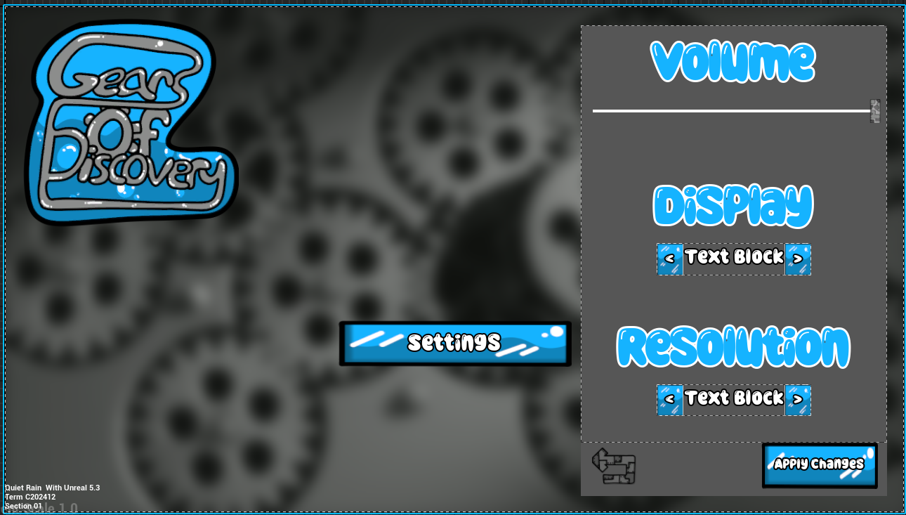
Settings Menu
The settings menu was a very fun menu to work on. This was a new experience for me when creating this menu and I got to experiment with quite a lot. I learned how to allow the player to set up their display preference (Fullscreen, Windowed Fullscreen, and Windowed) as well as set their desired resolution while in fullscreen. Within the settings menu as well the player is able to adjust the main volume settings. This slider controls all sounds within the game.